
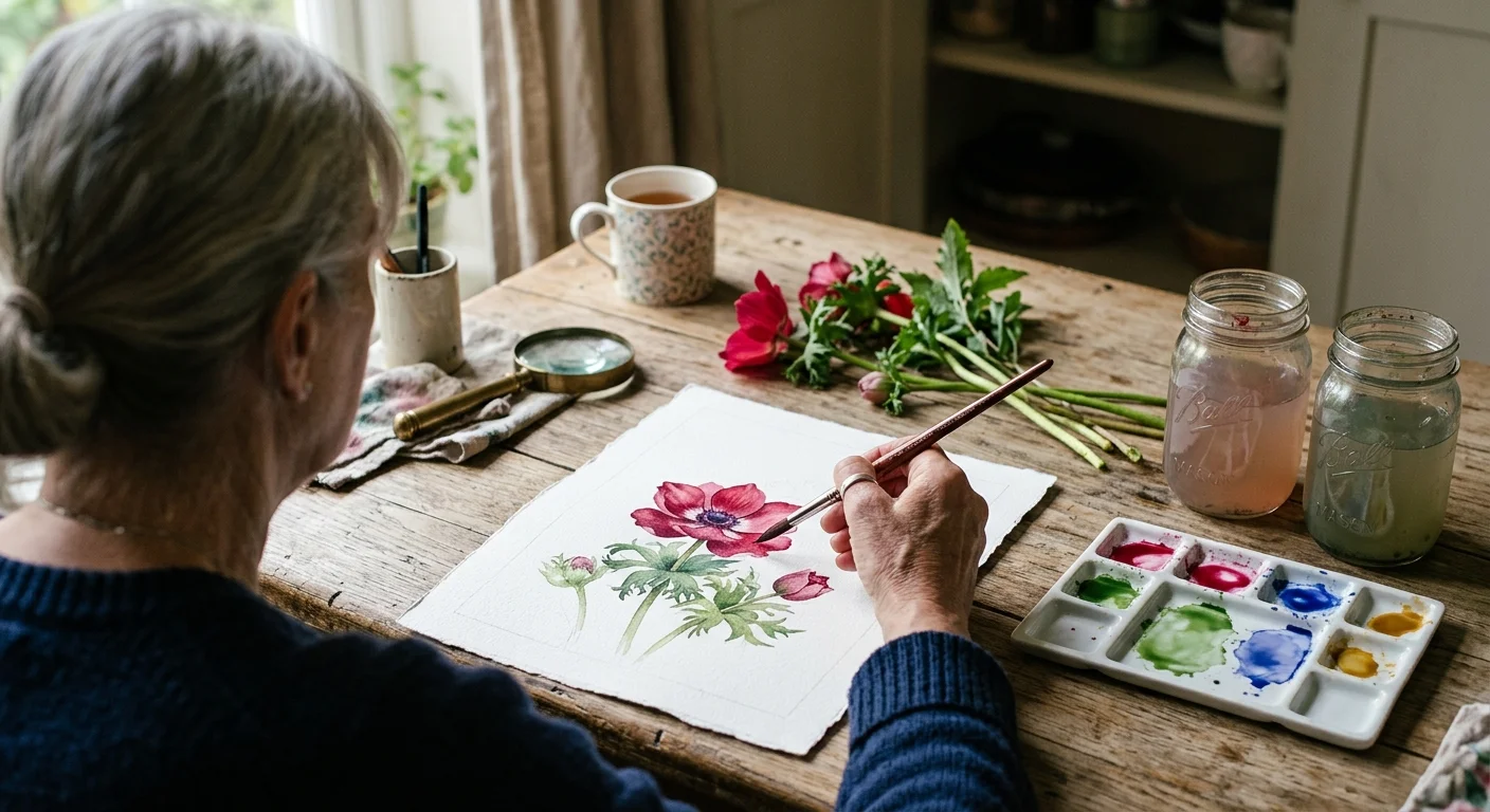
You can master realistic botanical watercolor from your kitchen table without enrolling in expensive art programs or buying cumbersome studio equipment. Painting backyard flora offers an immediate, tangible connection to your local ecology.
Observing living plants up close often mirrors the mindful rewards of retirement gardening as art, blending horticulture with aesthetic appreciation.
Most aspiring painters struggle with muddy flower petals and frustratingly warped sheets because traditional retail kits contain weak student fillers and light paper.
This guide details an exact twelve-pigment split-primary palette for under $65 and shows why 300lb paper permanently eliminates board stretching, giving you crisp, professional botanicals on your own terms.
The Science of the Botanical Split-Primary Palette
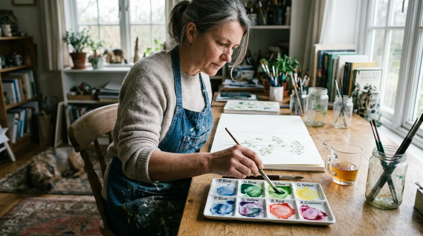
Botanical illustration demands exact color matching to replicate the vivid petals and subtle stem transitions found in your garden. Many beginners purchase pre-packaged 24-pan sets and immediately wonder why their mixed greens look dull and muddy.
Pre-mixed convenience colors often contain three or four separate pigments. Every time you combine multi-pigment paints, you introduce competing wavelengths that absorb light and create brown, lifeless sludge on your page.
A split-primary palette solves this chemical dilemma through simple color physics. By selecting one warm version and one cool version of each primary color, you isolate pure color pathways.
Cool yellows lean toward green, while warm yellows lean toward red. Cool reds lean toward violet, while warm reds carry yellow undertones.
When you mix pigments that lean toward each other on the color wheel, you create vibrant secondary colors without any tertiary contamination. This level of intentional observation also provides wonderful cognitive stimulation.
Research published by the Stanford Center on Longevity demonstrates that engaging in novel, complex visual-spatial activities fosters neuroplasticity and sharpens mental acuity in our second fifty years.
Mastering this color balance does not require natural talent; it simply requires the correct chemical foundation on your palette.
“The richness I achieve comes to me through nature, the source of my inspiration.” — Claude Monet
The Exact 12-Pigment Botanical Roster Under $65
You do not need to spend hundreds of dollars on luxury paint lines to produce exhibition-quality botanical plates. Professional-grade paints in 10-milliliter tubes deliver rich pigment loads that dilute smoothly across damp paper.
If you enjoy working outside the home, a compact setup pairs well with ideas from an 8-pound plein air travel kit.
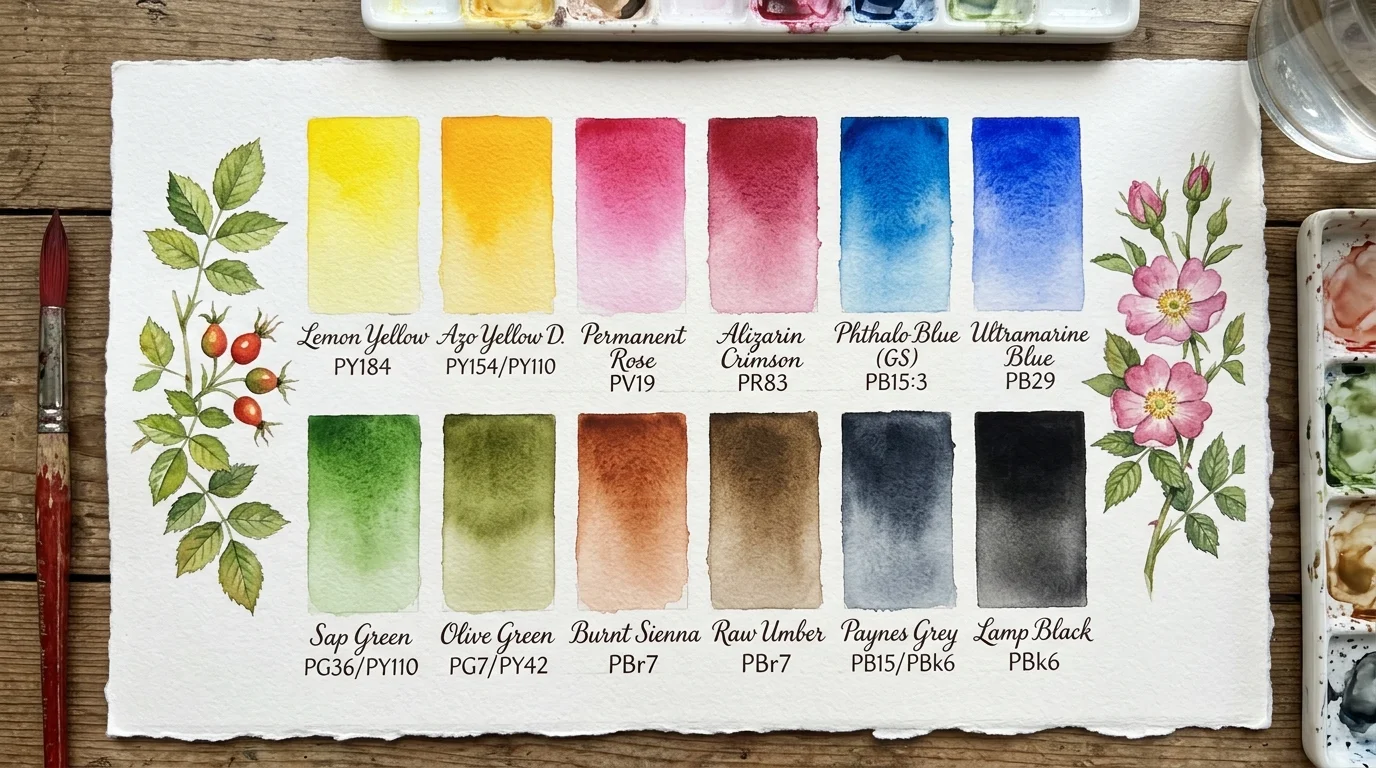
The following twelve-tube roster balances single-pigment purity with high lightfastness ratings. Using open-stock pricing for Van Gogh Watercolor 10ml tubes, this entire artist-grade collection costs $60.90 before tax.
- Cool Yellow: Lemon Yellow (PY184) — Crisp, semi-transparent yellow with a distinct green bias; essential for early spring shoots and translucent flower petals ($5.10).
- Warm Yellow: Azo Yellow Deep (PY154/PY110) — Rich golden yellow with red undertones; perfect for autumn foliage, stamens, and warm seed heads ($5.10).
- Warm Red: Permanent Red Light (PR254) — Brilliant scarlet red; ideal for ladybugs, rosehips, and the fiery petal rims of zinnias ($5.10).
- Cool Red: Quinacridone Rose (PV19) — High-staining magenta; produces luminous pinks and vibrant wild orchid tones when washed thinly ($5.45).
- Warm Blue: Ultramarine Deep (PB29) — Granulating, deep violet-leaning blue; creates velvet shadows under leaf folds and mixes rich botanical darks ($5.10).
- Cool Blue: Phthalo Blue Cerulean Shade (PB15:3) — Intense, high-tinting cyan blue; mixes brilliant lime greens and aquatic stem accents ($5.10).
- Earth Golden: Yellow Ochre (PY42) — Naturally opaque earth pigment; replicates dry seed capsules, woody twigs, and golden leaf veining ($4.85).
- Earth Warm: Burnt Sienna (PR101) — Transparent reddish-brown; indispensable for tree bark, drying petal margins, and soil tones ($4.85).
- Earth Cool: Raw Umber (PBr7) — Muted, greenish-brown tone; provides gentle shading for root systems without overwhelming pure botanical washes ($4.85).
- Organic Green: Phthalo Green BS (PG7) — Transparent cool green powerhouse; provides the clean chemical base to mix hundreds of backyard leaf shades ($5.10).
- Deep Floral: Dioxazine Violet (PV23) — Intense dark violet; deepens shadows behind petals and mixes deep iris tones at tiny dilutions ($5.45).
- Neutral Shadow: Payne’s Grey (PBk9/PB29) — Semi-opaque, cool slate grey; grounds your illustrations by creating lifelike stem cast shadows without harsh pure black ($4.85).
This single collection covers everything from the waxy cuticle of a magnolia leaf to the fragile petal of a wild violet. You will never need to buy convenience green tubes again.
Paper Physics: Why 300lb Heavyweight Eliminates Warping and Stretching
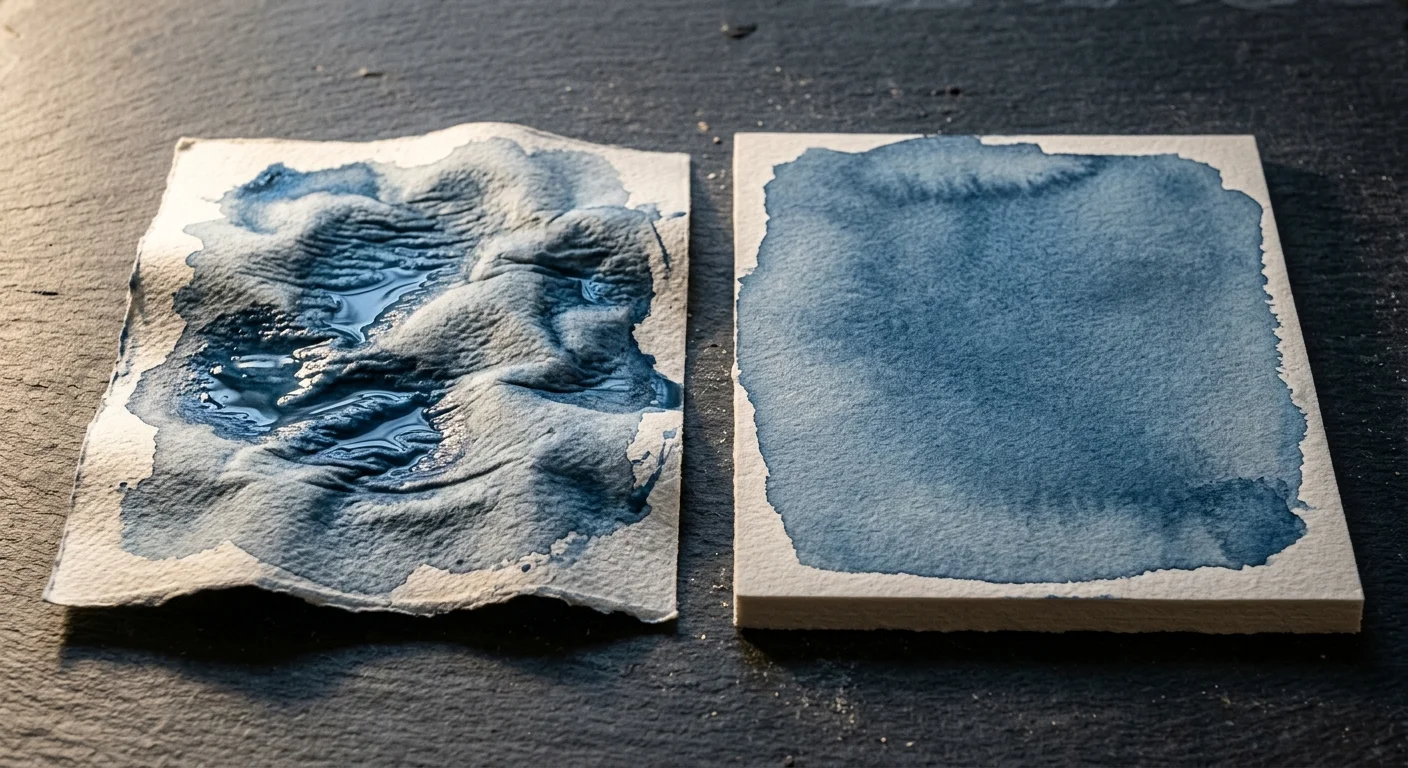
Most beginners start their watercolor journey on standard 140lb (300 gsm) paper. They quickly encounter severe rippling, water pooling, and irregular drying rings across their botanical washes.
Lightweight 140lb sheets expand unevenly when wet fibers swell, creating hills and valleys across your sheet. Standard studio procedure requires soaking the paper in a tub, stapling it to plywood, and applying gummed tape.
This time-consuming ritual discourages spontaneous painting sessions and strains arthritic fingers during setup. Switching to 300lb (640 gsm) cotton paper completely eliminates stretching and taping.
A 300lb sheet behaves like a solid wooden panel. The interwoven cotton rag fibers absorb massive volumes of water without expanding past their dimensional threshold.
You can place a dry 300lb sheet directly onto your table and apply heavy washes without a single piece of masking tape. The wash dries flat, smooth, and dimensionally stable every time.
| Paper Brand & Model | Weight & Fiber | Surface Sizing | Deflection at Full Wash | Cost per 22″x30″ Sheet |
|---|---|---|---|---|
| Arches Aquarelle 300lb Cold Press | 640 gsm, 100% Cotton | Gelatin tub-sized inside and out | 0.0 mm (Zero buckle) | $24.50 |
| Saunders Waterford 300lb High White | 640 gsm, 100% Cotton | Gelatin surface-sized | 0.0 mm (Zero buckle) | $22.80 |
| Fabriano Artistico 300lb Extra White | 640 gsm, 100% Cotton | Synthetic animal-free sizing | 0.0 mm (Zero buckle) | $21.75 |
| Canson Montval 140lb Cold Press | 300 gsm, Wood Pulp | Internal synthetic sizing | 8.5 mm (Severe buckle) | $5.20 |
While a full sheet of 300lb paper costs around $24, a single sheet yields eight generous 7.5″ x 11″ botanical plates. That equals just $3.06 per museum-grade painting surface.
The cold-press texture gives your brush just enough tooth to register delicate veins while holding smooth, velvety gradient washes.
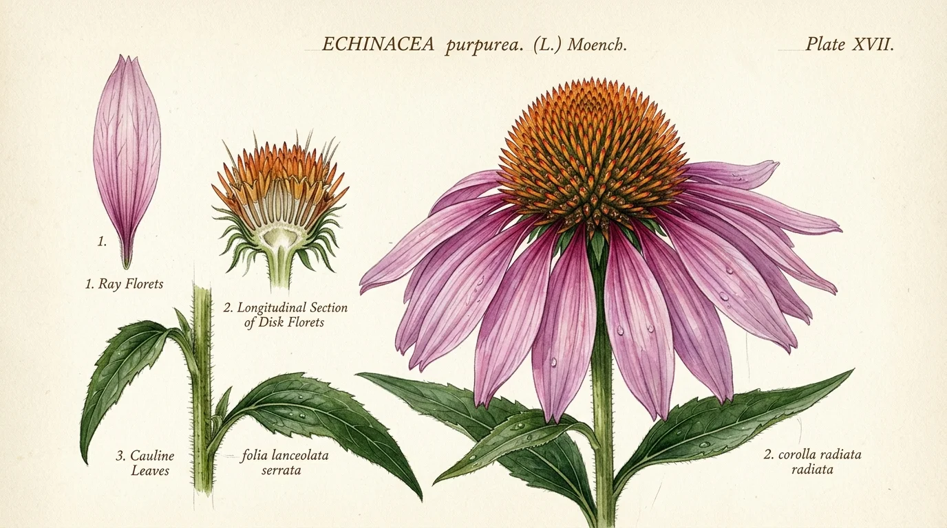
Worked Example: Painting an Eastern Purple Coneflower for Under $4
To understand how this system operates in practice, consider this worked scenario depicting an Eastern Purple Coneflower (Echinacea purpurea) from your garden.
This demonstration uses a 7.5″ x 11″ panel cut from a single Arches 300lb sheet, cost-modeled down to the penny.
- Substrate Cost: 1/8 sheet of 300lb Arches Cold Press ($3.06).
- Pigment Usage: Approximately 0.2ml total paint drawn from tubes ($0.22).
- Total Material Cost: $3.28 for a lightfast, heirloom botanical plate.
- Total Painting Time: 65 minutes across three layered washes.
Begin by sketching the coneflower’s spiny central cone and drooping ray florets lightly using a 2H graphite pencil. Press lightly to avoid indenting the thick cotton surface.
Mix your petal base tone: combine 3 drops of clean water with a pinhead-sized dab of Quinacridone Rose (PV19) and a micro-touch of Ultramarine Deep (PB29). This yields a luminous, cool magenta.
Apply the petal wash using a size 6 round synthetic brush. Notice how the 300lb paper remains rigidly flat as water floods the petal outlines.
Allow the first wash to cure for 14 minutes until completely dry to the touch. You will not see a single ripple along the edges of the sheet.
For the spiky central cone, mix Burnt Sienna (PR101) with Azo Yellow Deep (PY154). Tap tiny points of concentrated pigment onto damp paper to simulate the bristly seed florets.
Finally, ground your botanical illustration by mixing Payne’s Grey (PBk9) and Raw Umber (PBr7) into a pale shadow tint. Wash this directly underneath the drooping petals to add instant dimensional depth.
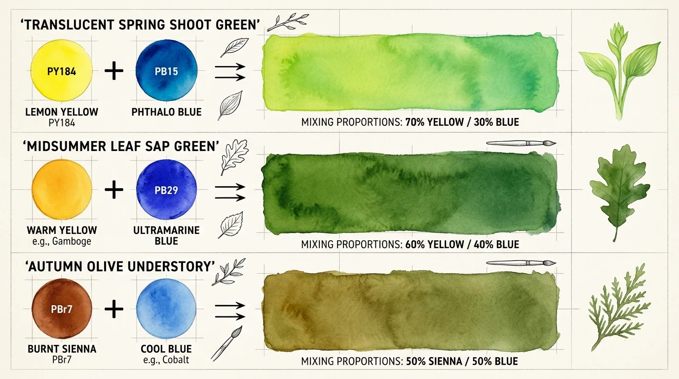
Step-by-Step Mixing Recipes for Backyard Botanical Greens
Pre-mixed greens from tubes rarely match real garden foliage. Real leaves contain undertones that change depending on seasonal sunlight and cellular structure.
Cultivating cut blooms directly outside your door—similar to the approach seen in this backyard flower farm story—provides a steady seasonal supply of fresh botanicals to paint.
By blending your primary yellows and blues with selective earth pigments, you can accurately capture any native species in your yard. Follow these four proven mixing formulas:
- Fresh Spring Budding Green: Mix 4 parts Lemon Yellow (PY184) with 1 part Phthalo Green (PG7). This produces an electric, high-chroma yellow-green that replicates emerging fern fronds and tender hosta leaves.
- Waxy Mature Oak Olive: Mix 3 parts Azo Yellow Deep (PY154), 1 part Ultramarine Deep (PB29), and 1 part Burnt Sienna (PR101). The Burnt Sienna neutralizes the blue, delivering the leathery green found on mature oak and holly foliage.
- Sunlit Stem Lime: Mix 5 parts Lemon Yellow (PY184), 1 part Phthalo Blue (PB15:3), and a whisper of Yellow Ochre (PY42). This semi-opaque mixture holds clean edges along thin stems without spreading unpredictably.
- Deep Under-Canopy Shadow Green: Mix 2 parts Phthalo Green (PG7), 2 parts Quinacridone Rose (PV19), and 1 part Raw Umber (PBr7). The Quinacridone Rose chemically cuts the artificial glare of the green, producing a rich, velvety shadow tone.
Always test your mixed wash on a scrap strip of 300lb paper before touching your main illustration. Watercolors dry approximately twenty percent lighter than they appear when wet.
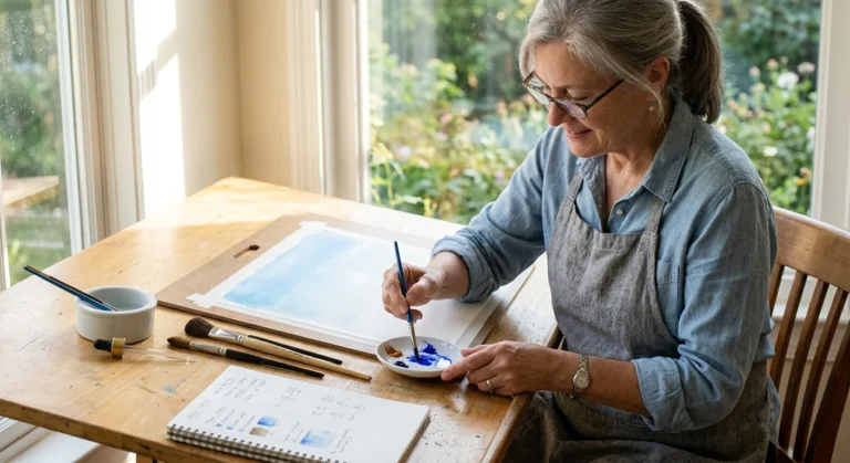
Document your formulas in a small field notebook beside pressed leaf specimens. Building your own color catalog turns afternoon garden strolls into rewarding botanical investigations.
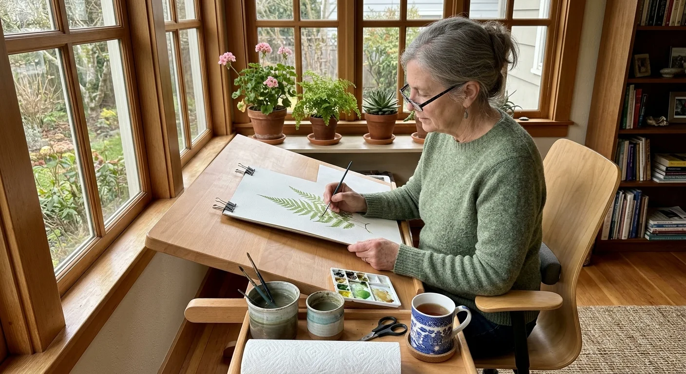
Ergonomic Studio Setup for Pain-Free Painting Sessions
Painting delicate botanical details should never strain your neck, back, or hands. Setting up a mindful workspace ensures you can paint comfortably for hours.
Never paint on a completely flat desk surface. Hunched shoulders and bent necks quickly produce spinal tension and eye strain during detailed line work.
- Elevate Your Board: Prop your 300lb painting panel on an adjustable desktop slant board set at an angle between 15 and 20 degrees. This keeps your cervical spine neutral and lets gravity draw water smoothly down your washes.
- Modify Your Brush Grips: Slip foam ergonomic pencil grips over your watercolor brushes. This simple addition broadens your grip diameter and prevents finger cramping during fine detail work.
- Position Your Light Source: Place an adjustable daylight lamp (5000K color temperature) on the side opposite your dominant painting hand. This prevents your hand from casting dark shadows over fine brush marks.
- Hydrate and Rest Your Eyes: Take a 5-minute break every 30 minutes to look at distant trees through your window. Focusing on the horizon resets your ciliary eye muscles and keeps your vision fresh.
Retirement is the premier season to master purposeful arts that celebrate the natural world. Lifelong educational programs, like those offered through Osher Lifelong Learning institutes, highlight how creative disciplines enrich daily routines.
With an exact 12-pigment split palette and stable 300lb paper, you possess every technical tool needed to capture your garden’s botanical beauty with complete artistic confidence.
Frequently Asked Questions
Why is 300lb paper better than 140lb paper for beginners?
Heavyweight 300lb paper contains double the cotton density of standard 140lb sheets. It absorbs heavy wet washes without rippling, eliminating the need to soak, stretch, or tape paper to heavy wooden boards.
Can I mix true botanical purples using a basic starter set?
Standard starter kits typically provide warm cadmium reds that contain yellow undertones. Mixing yellow-biased reds with blue introduces all three primary colors, which inevitably creates muddy brown instead of vibrant violet.
How many paintings can I produce from a 10ml tube of artist watercolor?
A single 10-milliliter tube of artist-grade watercolor provides enough concentrated pigment for approximately 50 to 80 detailed quarter-sheet botanical illustrations. You only need tiny, pea-sized amounts for each painting session.
Do I need cold-press or hot-press paper for native garden plants?
Cold-press paper provides a subtle micro-texture that holds washes evenly and forgives minor brush errors. While hot-press paper offers a silky surface, it dries rapidly and can cause frustrating water rings for beginners.
Disclaimer: This article is for informational and inspirational purposes. Life decisions are deeply personal, and we encourage readers to pursue their dreams while considering their unique circumstances, health, and financial situation.


1 Comment